plt.plot(x, cos_x, label='cos x')
plt.plot(x, sin_x, label='sin x')
plt.legend()
plt.show()Plotting (Good)
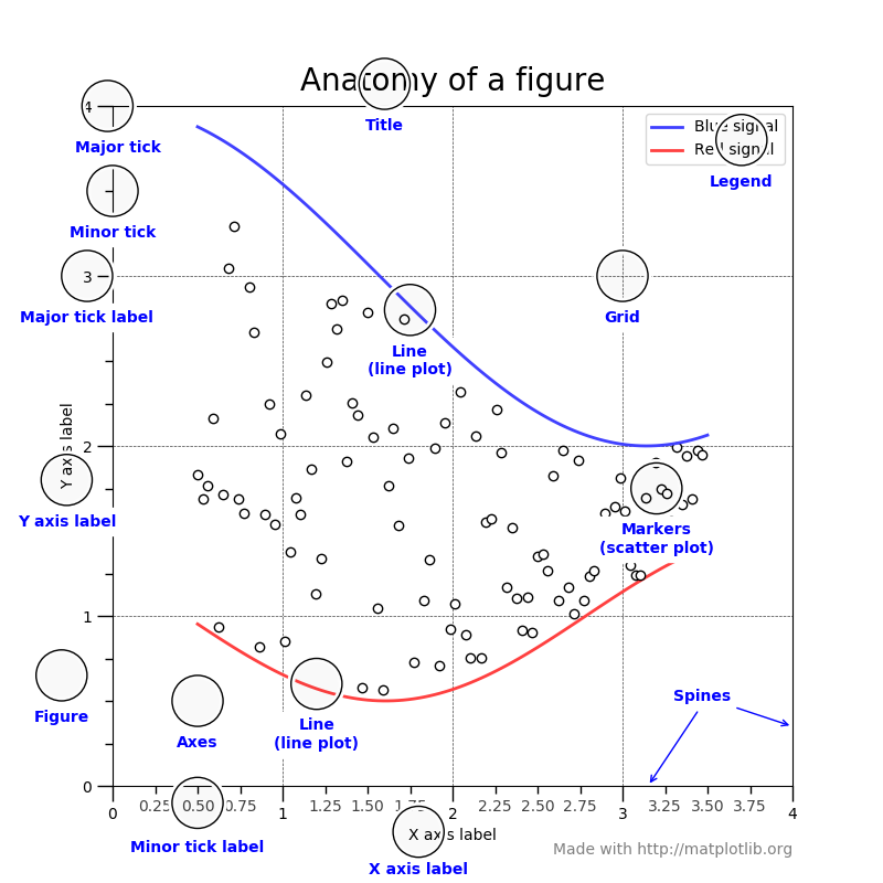
The various parts of a matplotlib figure. (From matplotlib.org)
What to Expect in this Chapter
In the previous chapter, we saw how you could use matplotlib to produce simple decent-looking plots. However, we haven’t really (barely) tapped the full power of what matplotlib can do. For this, I need to introduce you to a different way of speaking to matplotlib. So far, the ‘dialect’ we have used to speak to matplotlib is called the Matlab-like pyplot(plt) interface. From here onward, I will show you how to use the other, more powerful ‘dialect’ called the Object Oriented (OO) interface. This way of talking to matplotlib gives us more nuanced control over what is going on by allowing us to manipulate the various axes easily.
Comparing the two ‘dialects’
Some nomenclature
Before going ahead, let’s distinguish between a matplotlib figure and an axis.
A figure is simple; it is the full canvas you use to draw stuff on. An axis is the individual mathematical axes we use for plotting. So one figure can have multiple axes, as shown below, where we have a (single) figure with four axes.
By the way, you had already encountered a situation with multiple axes in the last chapter when we used twinx(). It is common to struggle with the concept of axes; but don’t worry; it will become even clearer later.
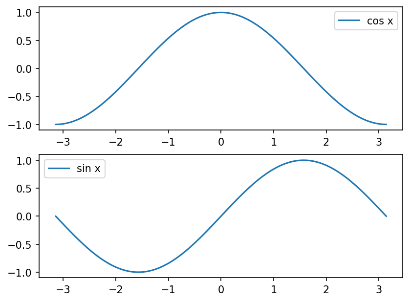
To see how the OO interface works, let me create the same plot using both ‘dialects’. The plot I will be making is shown below.
We need some data.
First, let’s generate some data to plot.
x = np.linspace(-np.pi, np.pi, num=100)
cos_x = np.cos(x)
sin_x = np.sin(x)
Here comes the comparison

pyplot Interface
OO Interface
fig, ax = plt.subplots(nrows=1, ncols=1)
ax.plot(x, cos_x, label='cos x')
ax.plot(x, sin_x, label='sin x')
ax.legend()
plt.show()
Both sets of code will produce the same plot. For the OO interface, we have to start by using subplots() to ask matplotlib to create a figure and an axis. matplotlib obliges and gives us a figure (fig) and an axis (ax).
Although I have used the variables fig and ax you are free to call them what you like. But this is what is commonly used in the documentation. So in this example, I need only one column and one row. But, if I want, I can ask for a grid like in the plot right at the top.
Remember
to use the pyplot interface for quick and dirty plots and the OO interface for more complex plots that demand control and finesse.
Using the OO Interface
Getting ax
Let me show you how to split the plots into two separate panes (with two axes) arranged as a column, as shown above. This will also allow us to get comfortable with using ax.
To get the above plot, we need to ask for two rows (nrows=2) and one column (ncols=1).
fig, ax = plt.subplots(ncols=1, nrows=2)This should give me two axes so that I can plot in both panes.
What is ax
Let’s quickly check a few more details about ax.
What is
ax?type(ax)<class 'numpy.ndarray'>So
axis a NumPy array!What size is
ax?ax.shape(2,)As expected,
axhas two ‘things’.What is contained in
ax?type(ax[0])<class 'matplotlib.axes._subplots.AxesSubplot'>This is a
matplotlibaxis.
Plots in a column
Now, let use these axes to plot our data.
First plot
ax[0].plot(x, cos_x, label='cos x')Second plot
ax[1].plot(x, sin_x, label='sin x')Notice how I use the different axes to plot the \(\cos(x)\) and \(\sin(x)\) data.
Legends
If we want to show the legends, then we have to call it for each axis:
First plot
ax[0].legend()Second plot
ax[1].legend()However, a more sensible way to do this is with a for loop that iterates through the items in ax:
for a in ax:
    a.legend()
Let’s also add the grid to each of the axes.
for a in ax:
    a.legend()
    a.grid(alpha=.25)
Tweaks
Let’s tweak a few details of the plots.
- Let’s change the size of the plot by specifying a figure size (
figsize). - Let’s ask that the plots share the \(x\)-axis using
sharex.
fig, ax = plt.subplots(nrows=2, ncols=1,
                       figsize=(5, 10),   # 10 x 5 inches!
sharex=True)- Let’s add a \(x\) label.
ax[1].set_xlabel('$x$')Take note that we have to use set_xlabel() with the OO interface and not xlabel().
- Let’s fill our plot between \(0\) and the respective plot values.
ax[0].fill_between(x, 0, cos_x, alpha=.25)
ax[1].fill_between(x, 0, sin_x, alpha=.25)- Let’s add a super title to the figure.
fig.suptitle(r'$\sin(x)$ and $\cos(x)$')- Finally, let’s ask
matplotlibto make any necessary adjustments to the layout to make our plot look nice by callingtight_layout(). It would help if you convinced yourself of the utility oftight_layout()by producing the plot with and without it.
fig.tight_layout()Et Voila!
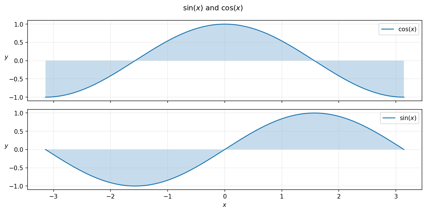
Here is the full code.
fig, ax = plt.subplots(nrows=2, ncols=1,
                       figsize=(10, 5),   # 10 x 5 inches!
                       sharex=True)
ax[0].plot(x, cos_x, label=r'$\cos(x)$')
ax[0].fill_between(x, 0, cos_x, alpha=.25)
ax[1].plot(x, sin_x, label=r'$\sin(x)$')
ax[1].fill_between(x, 0, sin_x, alpha=.25)

for a in ax:
    a.legend()
    a.grid(alpha=.25)
    a.set_ylabel('$y$', rotation=0)

ax[1].set_xlabel('$x$')

fig.suptitle(r'$\sin(x)$ and $\cos(x)$')
fig.tight_layout()

plt.show()
More rows and columns
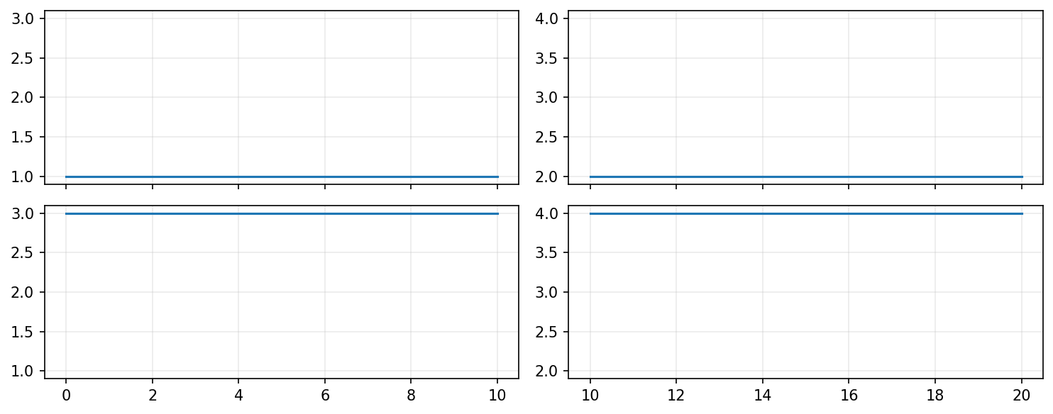
Now I will show you how to work with a grid of axes like that shown above.
I have intentionally used simple straight lines so we can focus on the details of the plotting. So, for example, there are two sets of \(x\) values, and I have used np.ones_like() to generate an array of 1’s that has the same length as the x array.
Take a look at the code and see if things make sense. I will take you through the details in a bit.
fig, ax = plt.subplots(nrows=2, ncols=2,
                       figsize=(10, 4),
                       sharex='col', sharey='col')

# Some variables to access the axes and improve readabilty
top_left, top_right, bottom_left, bottom_right = ax.flatten()

# x data for plotting
x1 = np.linspace(0, 10, 100)
x2 = np.linspace(10, 20, 100)

top_left.plot(x1, np.ones_like(x1))
top_right.plot(x2, 2*np.ones_like(x2))
bottom_left.plot(x1, 3*np.ones_like(x1))
bottom_right.plot(x2, 4**np.ones_like(x2))

for a in ax.flatten():
    a.grid(alpha=.25)

plt.tight_layout()
plt.show()
Using ax
The most important thing you need to understand is how to access ax. Of course, we know there must be four axes; but how is ax structured?
If you run ax.shape() you will get (2,2). So, ax is organised as you see, as a 2 x 2 array. So, I can access each of the axes as follows:
ax[0, 0].plot(x1, np.ones_like(x1))
ax[0, 1].plot(x2, 2*np.ones_like(x2))
ax[1, 0].plot(x1, 3*np.ones_like(x1))
ax[1, 1].plot(x2, 4**np.ones_like(x2))
This is a perfectly valid way to use ax. However, when you have to tweak each of the axes separately, I find it easy to use a familiar variable. I can do this by:
top_left=ax[0, 0]
top_right=ax[0, 1]
bottom_left=ax[1, 0]
bottom_right=ax[1, 1]
You can also use:
top_left, top_right, bottom_left, bottom_right = ax.flatten()flatten() takes the 2D array and flattens it into a 1D array; unpacking takes care of the assignments.
Sharing axes
I can ask matplotlib to make the plots more compact by sharing the \(x\) and \(y\) axes using sharex (or sharey). Let’s first see what happens if I do not specify how to share. i.e. if the code is:
fig, ax = plt.subplots(nrows=2, ncols=2,
                       figsize=(10, 4))
The plots will then look as below because matplotlib auto scales both axes.
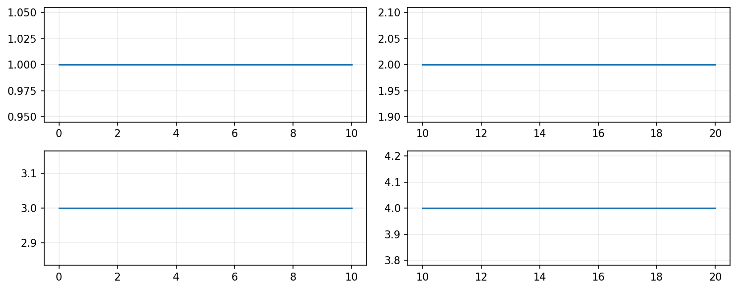
Now let me specify how to share the axes. I can specify this in three ways:
| Option | Result |
|---|---|
True |
Makes all the axes use the same range. |
col |
Use the same range for all the columns |
row |
Use the same range for all the rows |
So, the following will yield:
fig, ax = plt.subplots(nrows=2, ncols=2,
                       figsize=(10, 4),
                       sharex=True, sharey='row')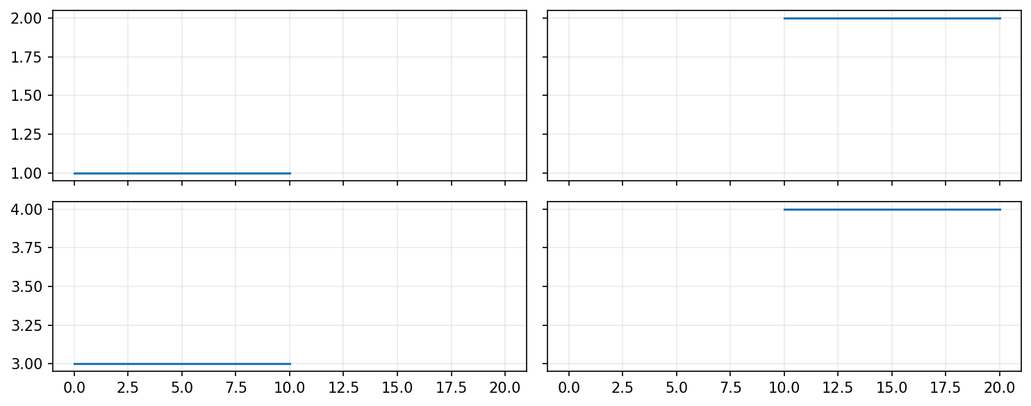
However, sharex='col' is more suited for the data we are plotting, so I have used that instead.
I must add that the most correct option is the one that highlights the story you are trying to convey with your plot.
Accessing all axes
You will often want to apply changes to all the axes, like in the case of the grid. You can do this by
top_left.grid(alpha=.25)
top_right.grid(alpha=.25)
bottom_left.grid(alpha=.25)
bottom_right.grid(alpha=.25)
But this is inefficient and requires a lot of work. It is much nicer to use a for loop.
for a in ax.flatten():
    a.grid(alpha=.25)
Other useful plots
In this section, I will quickly show you some useful plots we can generate with matplotlib. I will also use a few different plot styles I commonly use so that you can get a feel for changing styles.
Histograms
A histogram is a valuable tool for showing distributions of data. For this example, I have extracted some actual data from sg.gov related to the mean monthly earnings of graduates from the various universities in Singapore.
Here are the links to my data files:
| Mean basic monthly earnings by graduates | |
|---|---|
| All | sg-gov-graduate-employment-survey_basic_monthly_mean_all.csv |
| NUS Only | sg-gov-graduate-employment-survey_basic_monthly_mean_nus.csv |
data = {}

filename = 'sg-gov-graduate-employment-survey_basic_monthly_mean_all.csv'
data['All'] = np.loadtxt(filename, skiprows=1)

filename = 'sg-gov-graduate-employment-survey_basic_monthly_mean_nus.csv'
data['NUS'] = np.loadtxt(filename, skiprows=1)

plt.style.use('bmh')

plt.hist([data['All'], data['NUS']],
         bins=50,                        # How many bins to split the data
         label=['All', 'NUS']
         )
plt.xlabel('Mean of Basic Montly Eraning (S$)')
plt.ylabel('Number of Students')
plt.legend()
plt.show()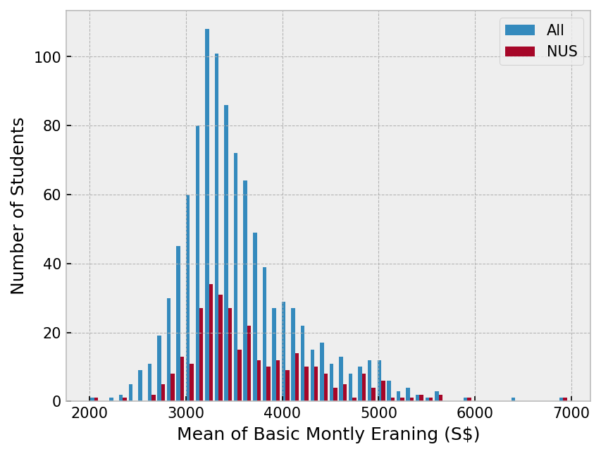
Scatter plots
Scatter plots are created by putting a marker at an \((x,y)\) point you specify. They are simple yet powerful.
I will be lazy and use the same data as the previous example. But, since I need some values for \(x\) I am going to use range() along with len() to generate a list [0,1,2...] appropriate to the dataset.
data = {}
for label in ['All', 'NUS']:
    filename = f'sg-gov-graduate-employment-survey_basic_monthly_mean_{label.lower()}.csv'
    data[label] = np.loadtxt(filename, skiprows=1)

plt.style.use('seaborn-darkgrid')

for label, numbers in data.items():
    x = range(len(numbers))
    y = numbers
    plt.scatter(x, y, label=label, alpha=.5)

plt.xlabel('Position in the list')
plt.ylabel('Mean of Basic Montly Eraning (S$)')
plt.legend()
plt.show()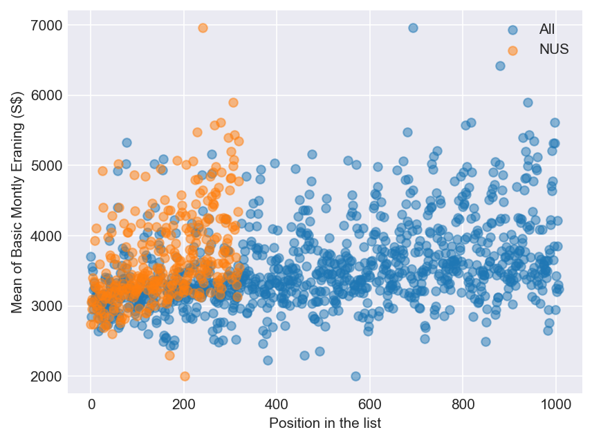
Bar charts
I am using some dummy data for a hypothetical class for this example. I extract the data and typecast to pass two lists to bar(). Use barh() if you want horizontal bars.
student_numbers = {'Life Sciences': 14,
                   'Physics': 12,
                   'Chemistry': 8,
                   'Comp. Biology': 1}
majors = list(student_numbers.keys())
numbers = list(student_numbers.values())

plt.style.use('ggplot')
plt.bar(majors, numbers)
plt.xlabel('Majors')
plt.ylabel('Number of Students')

plt.show()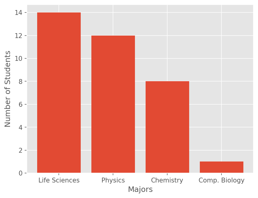
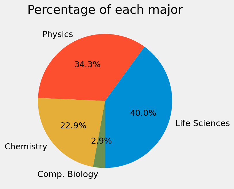
Pie charts
I am not a big fan of pie charts, but they have their uses. Let me reuse the previous data from the dummy class.
student_numbers = {'Life Sciences': 14,
                   'Physics': 12,
                   'Chemistry': 8,
                   'Comp. Biology': 1}
majors = list(student_numbers.keys())
numbers = list(student_numbers.values())

plt.style.use('fivethirtyeight')
plt.pie(numbers,
        labels=majors,
        autopct='%1.1f%%',   # How to format the percentages
        startangle=-90
        )
plt.title('Percentage of each major')
plt.show()